Mobile SEO: Why It Matters More Than Ever in 2025
Editor’s Note: This post was originally published in September of 2024 and has been updated for accuracy and comprehensiveness.
Mobile SEO is the process of optimizing your website to make it accessible to users on mobile devices. This is because:
- 95.9% of people access the internet from their mobile phones.
- 92% of all mobile searches are made on the Google search engine, and
- According to Google, 82% of U.S. shoppers use their mobile devices for “near me” searches.
- Also, people with a negative user experience on a (usually unoptimized) mobile website are 62% less likely to buy from that site in the future, even if the website or company runs a beautiful marketing campaign.
All these point to the fact that if you’re not optimizing for mobile, you’re losing a place on the results page and could lose valuable clicks and traffic. Why is this important?
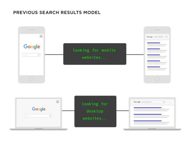
Before mobile optimization came to light, Google considered the device a user was searching from to determine search rankings.
For example, if a user searches for “shoes for babies” on a laptop and your website is optimized for desktop, it might rank well in the search results.
Using this logic, if your webpage is optimized for mobile, it’ll rank in the search results for similar keywords. However, it may not rank if the searcher searches from a desktop device. Here’s an illustration from Backlinko:
However, Google first announced mobile-first indexing in March 2020. This means Google uses the mobile version of your website’s content to index and rank it in search results, regardless of whether the user is searching from a mobile or desktop device.
Here’s what that looks like:
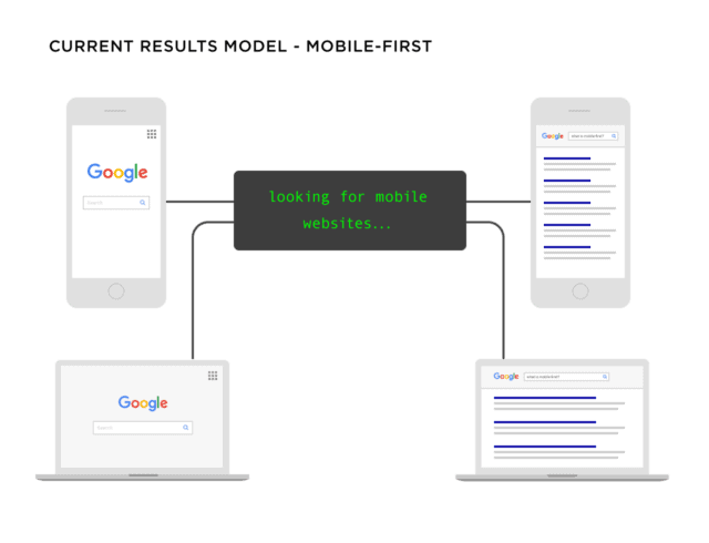
If your website is not optimized for mobile, it will struggle to rank well in search results across all devices.
In October 2023, Google announced it had finally transitioned to mobile-first indexing.
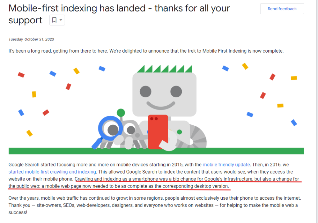
For context, if a potential customer searches for “shoes for babies” on their desktop or mobile devices and your site is not mobile-friendly, it could negatively impact your visibility.
So, what does this mean for your website, and how does mobile SEO help?
Reasons Why Mobile SEO Is Important in 2025
The primary function of mobile SEO is to improve your website’s visibility in search engine results pages (SERPs). Making your website mobile-friendly automatically means your content will rank higher.
Here are four other advantages:
1. It Improves Local SEO
According to studies, 57% of local search queries are through mobile devices. Mobile searches, in terms of local SEO, are structured as questions and include words like “how,” “where,” and “is.” From these, “near me” searches are more exclusive from mobile devices, and 76% of these searchers visit the physical business within 24 hours.
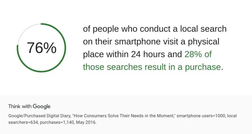
By optimizing for mobile, you can increase your rankings and the conversion rate from those clicks. Although you still need to optimize your business on Google Business Profile (to improve the chances of being listed as a local business), mobile SEO increases your visibility and rankings on local search results and Google map pack.
2. Improves Search Engine Ranking
Google loves a website that provides a smooth user experience, and when the bots crawl your website, they’re looking for evidence of this.
Some significant pointers are fast page speed, mobile-friendly designs, clickability, conspicuous calls to action, and other elements contributing to a positive user experience. If your website meets all these criteria, your chances of ranking higher on search engines increase.
However, Google won’t directly penalize your site if it’s not mobile-optimized. It will use your desktop version to rank your content, which can hurt your ranking since Google follows a mobile-first indexing approach.
This means that content not accessible or optimized for mobile devices won’t be visible in the search results.
Optimize your content and website design for mobile to maintain or improve your rankings. In other words, high-quality content is crucial, but it must also be mobile-friendly to be fully effective.
3. Influences Purchase Behavior
According to this research, approximately 56% of all online sales were made via smartphones in 2024. This number is expected to go up to 88% by 2027! This means visitors who struggle to read or navigate your site on their phones will likely leave, which translates to lost prospects.
Issues like small text, content stuffed with links, or content that doesn’t fit the screen properly can discourage users from engaging with your content or clicking on your call-to-action (CTA). These poor experiences will lead to high bounce rates, even on pages you’ve optimized for conversion.
Aside from these, with 47% of users expecting a page to load in under 2 seconds on mobile, anything longer than this can increase the bounce rate, and you could lose valuable leads and sales.
Learn More about Why Your Website is Slow and how to Fix It.
So, what are the elements of mobile SEO that increase your chances of winning on search engines?
Elements of Mobile SEO
Here are some essential entities that improve the value of your website and its content:
1. Page Speed
Website page speed is how long it takes your web page to load and display its content fully. It is one of the most important factors for mobile SEO because:
- Google considers page speed when ranking your web page.
- It has a direct influence on user search behavior.
Ideally, the average page load speed is 2.5 seconds on desktop and 8.6 seconds on mobile. However, this can vary by location. For instance, the average load time in the US is 1.9 seconds on mobile and 1.7 seconds on desktop.
However, in reality, 85% of B2B websites load in 5 seconds, but websites with a 1-second page speed have “a conversion rate 3x higher than a site that loads in 5 seconds.”
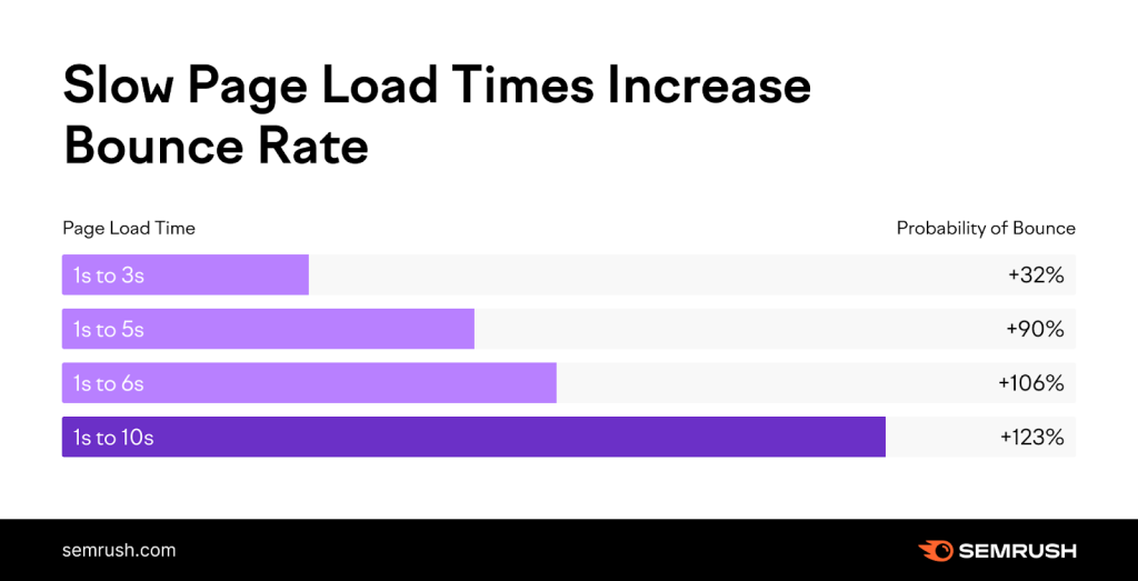
To be safe, aim for at least 3 seconds to reduce the possibility of bounce rate. According to this SEMrush data, anything above 3 seconds has a high bounce rate.
2. Responsive Design
A responsive design approach ensures your website is usable and visually appealing on all devices. This means your website has:
- A fluid layout and page elements (texts and design) can be adjusted based on the user’s screen size.
- Flexible images and media to ensure all media elements fit based on screen size without distortion or cropping.
- Touch-friendly navigation (using larger buttons and a well-spaced navbar to allow easy finger taps and reduce the chances of accidental clicks).
- Readable typography to ensure readability on all screen sizes.
Use the Google Chrome Developer tools to know if your website is responsive. I’ll explain how to do this in the next section.
3. Local SEO
Local SEO optimizes a business’s online presence to attract more customers from relevant local searches. It ensures:
- Your business profile is optimized on Google Business Profile.
- Your website content has local keywords to target nearby customers.
- Consistency in Name, Address, and Phone number (NAP) on all local listings.
- Visibility on online review platforms.
- Optimized location-specific landing pages to rank when users nearby search for keywords related to your business.
4. User Experience
User experience (UX) is how a user interacts with your website. Key elements of user experience include:
- Easy-to-use interface.
- The website is accessible even for people with disabilities. We wrote here about how to make your website ADA-compliant.
- It has visual appeal.
- The website loads fast, and the design is responsive.
- The website has SSL certificates to improve trustworthiness and credibility.
5. Mobile Content Optimization
This focuses on creating and structuring content to provide the best user experience on mobile devices. Some of the best practices include:
- Use a font size of at least 14 points for easy reading on small screens.
- Keep paragraphs short, no more than 2-3 lines long.
- Ensure high contrast between text and background for readability in various lighting conditions.
- Write concisely and avoid long blocks of text.
- Use headings (1,2,3,4,5), bullet points, and short sentences to make content scannable.
- Break up content into smaller, easily digestible chunks using H2s.
- Use responsive images that scale appropriately on different screen sizes.
- Compress images to reduce page load times.
6. Schema Markup
Schema Markup (or structured data) is a code you add to your website’s HTML to help search engines understand the content on your pages more effectively. This helps you:
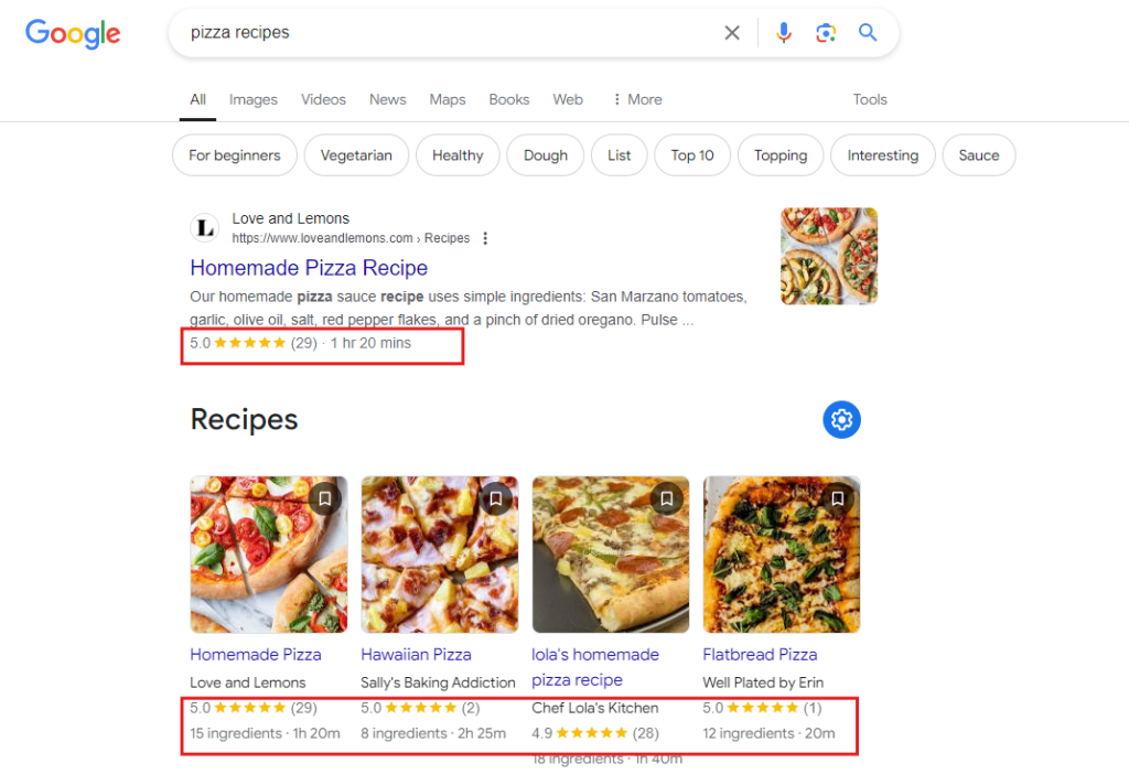
- Increase your visibility because search engines display richer results about your webpage. These can include images, star ratings, and other relevant information about your business (or the webpage).
See these results:
Compared to this:

From the two screenshots, you’re more likely to click on the results from the first picture because those websites share more details about the query “pizza recipes”.
To Google, your webpages can attract more quality links through schema markup because users see you’ll better meet their search intent.
Other benefits of schema markup for mobile SEO are:
- Improve user experience as it helps users find the information they need quickly.
- Support mobile searches with local intent because it provides details like business hours, addresses, and contact information. This is relevant for searches such as “restaurants near me” or “plumber in (city).”
How To Optimize Your Website for Mobile SEO
Here are four ways to further optimise your website for mobile SEO:
1. Make Your Website Easy to Crawl by Google
Crawlability determines whether search engines can discover and index your website’s pages. If your site is not crawlable, search engines may miss important content, meaning those pages will not appear in search results.
This lack of visibility can reduce organic traffic, you can avoid that by creating a clear and organized site structure.
Let me explain:
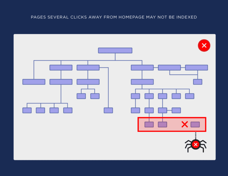
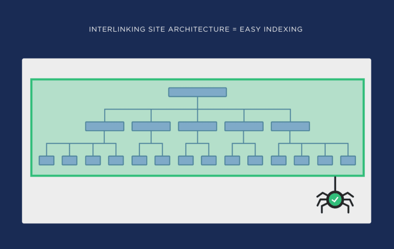
When users navigate your website on mobile devices, they expect to find what they need – fast. It’s the same for Google’s crawlers, they rely on a well-structured site to understand the relationship between different pages and prioritize which content to index and rank.
This is what a poor website architecture looks like:
How can you create this effective site structure to improve mobile SEO?
- Plan Your URL Hierarchy:
Use a logical and consistent URL structure that reflects the organisation of your content library. For example, a structure like example.com/category/subcategory/page helps users and crawlers understand the page’s context.
It means they got to your website > a category > sub-category> the page they’re on.
For context: website.com > blog > marketing > what-is-seo
Ideally, it should look like this:
- Limit Click Depth:
Ensure that any page on your site can be reached within a few clicks from the homepage (ideally, three clicks or fewer). This helps users and crawlers to find your content faster. For example, example.com/category/subcategory/page. That is, like this:
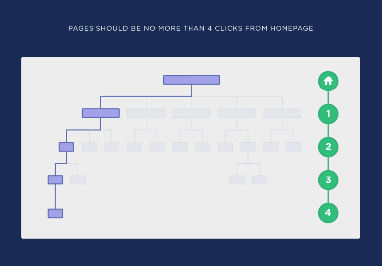
Not like this:

- Use Descriptive and Keyword-Rich URLs:
Your URLs should describe the page’s content so users can understand where they are on your site. It’ll also help crawlers index your content accurately. For example, https://www.highervisibility.com/ > website-design/ > learn/ > reasons-website-is-slow-how-to-fix/.
- Create an XML Sitemap:
An XML sitemap lists all critical pages on your site to help crawlers find and index them. Submit your sitemap to Google Search Console to help prioritise mobile-friendly pages. Here are the full details on how to build and submit your sitemap.
You can also optimize your robot.txt file for mobile SEO to enable crawlability. Read this guide to learn what the robot.txt file is, how to find it, and how to create one for your website.
2. Check Your Site’s Mobile Optimization
The first step to improve your site’s mobile optimization is to know how mobile-optimized your site is. A simple method is to check your website on different devices. Check what it looks like on Android, iPhone, tablet, and desktop to see things like:
- The page speed on all the devices.
- Content readability (without zooming in or out).
- If the navigation bar is easy to use on all devices (especially mobile).
- If your site’s layout adjusts well to a smaller screen.
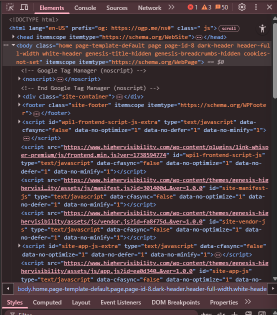
You can also determine your site’s mobile optimization with the Google Chrome Developer tool. This tool lets you see how your website renders on different screen sizes, including mobile and desktop.
Here’s how to check if your website is mobile-friendly:
Step 1:
Type out your website into the Chrome search bar
Step 2:
Click the three dotted icon on the top right corner of the menu bar:

Step 3:
Scroll down the menu and click “more tools >> Developer tools.” You’ll see the back end of our website displayed like this:
Step 4.
Click the “Device toggle bar” icon.

Step 5.
Right under “Responsive Dimensions”, you can see how your website responds accordingly:

3. Use Popups Strategically to Avoid High Bounce Rate
Pop-ups are annoying. If you can, avoid them.
They distract readers from your content, are sometimes irrelevant, and are usually difficult to close. These make your website more complicated to use and can hurt your SEO (because most users will leave, which will lead to a high bounce rate).
Every user hates pop-ups that won’t leave the screen; Google also penalizes websites with intrusive pop-ups. According to Google, some of the pop-ups that a website could be penalized for are:
- Pop-ups that appear immediately when a user lands on a page.
- Pop-ups that cover a large part of the screen.
- Pop-ups that ask for user interaction before they can access the content.
- Pop-ups that take them to another page.
A pop-up that’s easy to close is better:
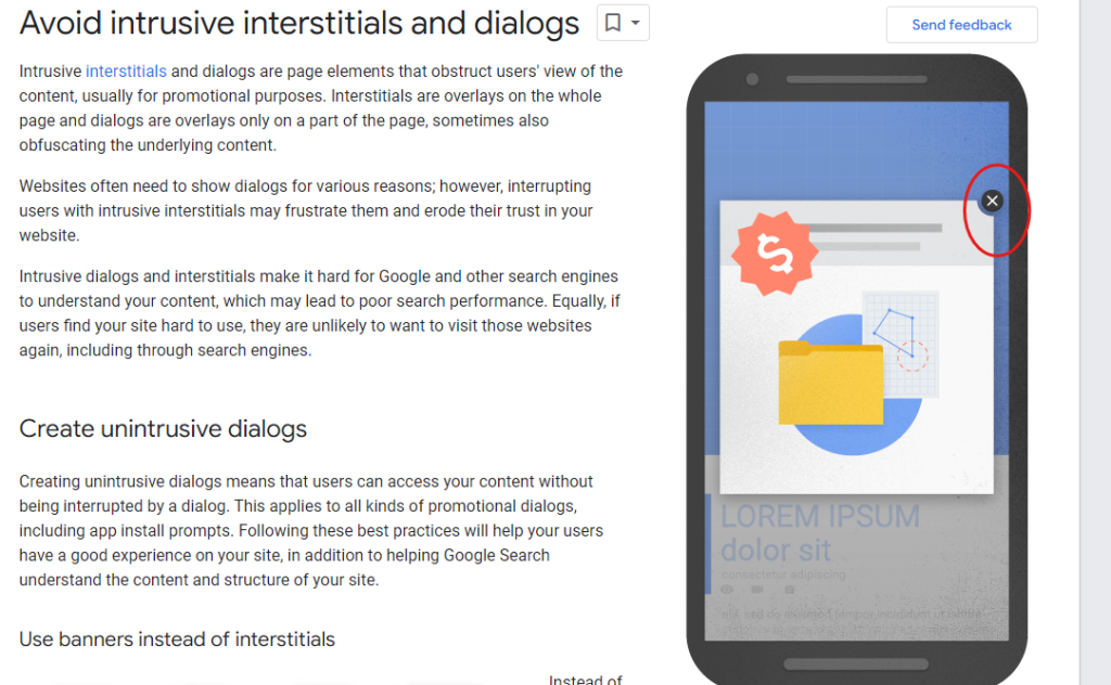
To avoid getting penalized,
- Use pop-ups that are not too intrusive.
- Use banners that do not cover the main content.
- Make sure any pop-ups on your site are easy to dismiss.
- Pop-ups should only cover a small portion of the screen.
- Pop-ups should not hinder access to content on the page.
You can also use banners that occupy a small fraction of the screen over full pop-ups. Here’s an example from Google:
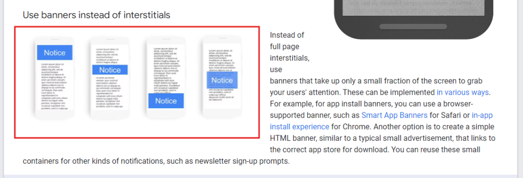
Here’s another example from SEMrush:

SEMrush’s pop-up is particularly non-intrusive and only shows up when you’re 25% into a SEMrush article. The best part? You can click “X” to remove it from your screen.
4. Optimize for Google Core Web Vitals to Improve Page Experience
Google Core Web Vitals are metrics used to measure user experience on your website. This includes your web pages’ loading performance, interactivity, and visual stability. Google segments these metrics into three:
i. Largest Contentful Paint (LCP):
This measures how long your web page’s most significant content element loads fully. Your LCP should be 2.5s or less for a good user experience.
Some of the issues that affect your website page speed include:
- Large image and media files that make the webpage too large to load fast.
- Unoptimized and excessive Javascript, CSS, or HTML codes that increase the time for the browser to render a page.
- Slow server response time is a problem, especially when using an unreliable hosting provider or when there’s a spike in your web traffic.
- There are usually too many plugins and extensions if you use WordPress as your CMS.
These different issues will reduce the speed of your website and will affect its overall functionality. We wrote at length about why your website is slow and how to fix it here.
ii. Interaction to Next Paint (INP):
This measures how responsive your web page is once fully loaded. It is more important if it’s a sign-up, login, or checkout page with significant user interaction. On average, your INP should be 200 milliseconds or less for a more enjoyable user experience.
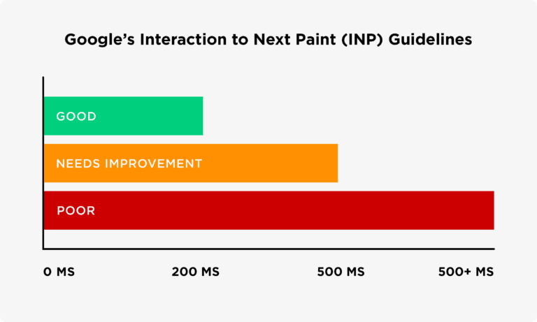
There are several ways to improve your NIP score:
- Remove unnecessary third-party scripts that slow down a web page.
- Use a reliable web host with at least 99.9% uptime and speed optimization features.
- Minify bulky, unoptimized CSS, JavaScript, or HTML files.
iii. Cumulative Layout Shift (CLS):
This measures how your web page renders as it loads. That is, how stable the elements and design are as the page loads. Ideally, your web page should be static whenever it’s loading to prevent a bad user experience. So, aim for a CLS score of 0.1 or less, according to Google’s benchmarks:
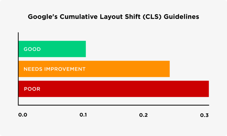
To reduce your CLS score:
- Avoid adding new content such as banners or pop-ups above the fold that can shift the vital information down when they load.
- Use Google’s dimensions for images and videos to ensure they load correctly on the page.
How to Check Your Website’s Google Core Web Vitals Metrics:
There are three ways you can check your CWV metrics:
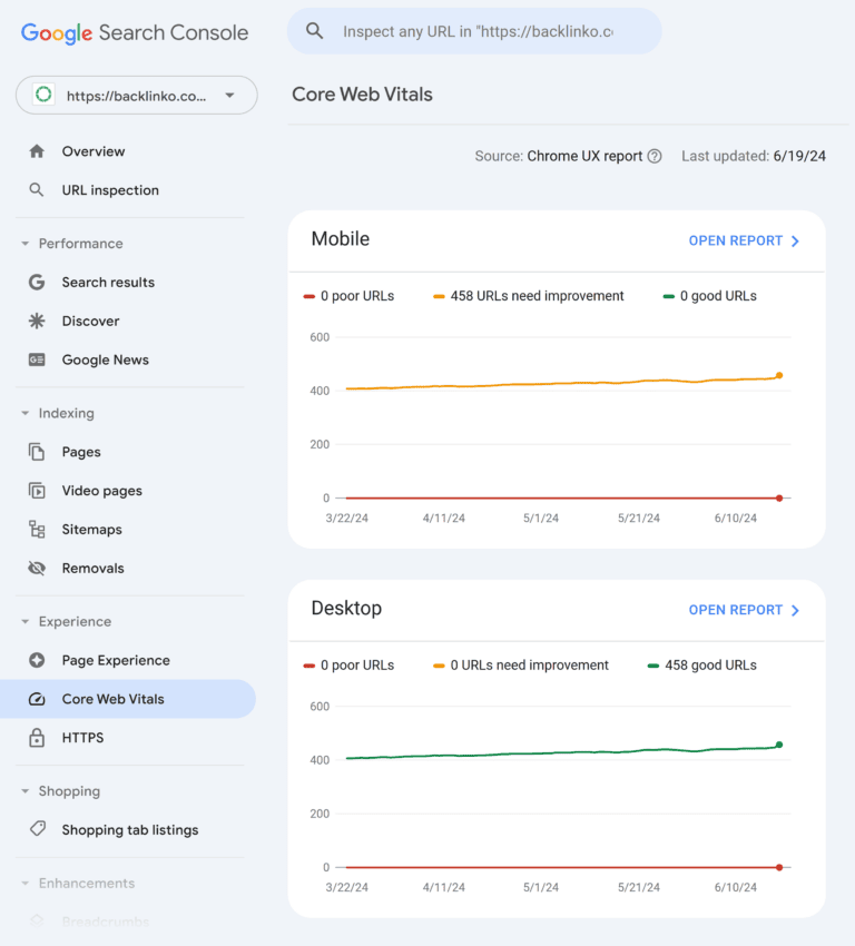
i. Using Google Search Console:
Log in to your GSC account and click “Experience >> Core Web Vitals.” You’ll see the reports for mobile and desktop users:
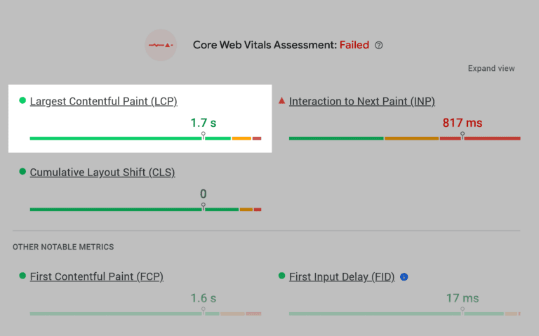
ii. Using PageSpeed Insights:
Google’s page speed insights also provide rich insights into your website performance, including the core web vitals. Here, you’ll see each score for CLS, INP, and LCP:
iii. Any third-party SEO tool:
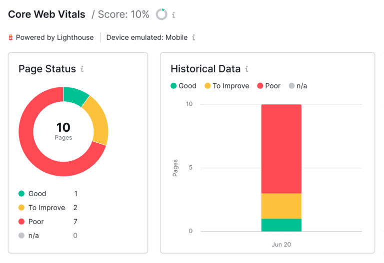
Third-party SEO tools such as SEMRush or Ahrefs also help you find technical SEO issues on your website, including the CWV scores:
5. Optimize for Voice Searches
Voice search is fast becoming the new normal. According to Statista, the number of people using digital voice assistants doubled from 2019 to 2024:

Also, voice assistants are pre-installed on iPhones, Samsung devices, Android phones, and even laptops to enable users to perform searches, make calls, and send text messages with simple voice commands. This means that as the number of mobile device users increases globally, the number of voice searches also increases.
Optimizing your website for voice searches helps you to:
- Appear for voice-based searches.
- Enables you to reach more customers.
- Improves accessibility for mobile and visually impaired individuals using natural language processing.
- It helps you gain a competitive advantage and rank for zero-click searches.
Here are some voice optimisation tips:
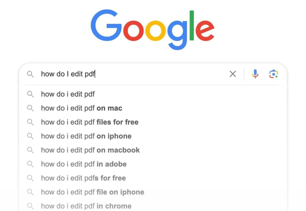
- Target long-tail, conversational keywords. For example, keywords include words that real people use like “what,” “how,” “when,” and “where.” You can get suggestions from the Google autocomplete feature:
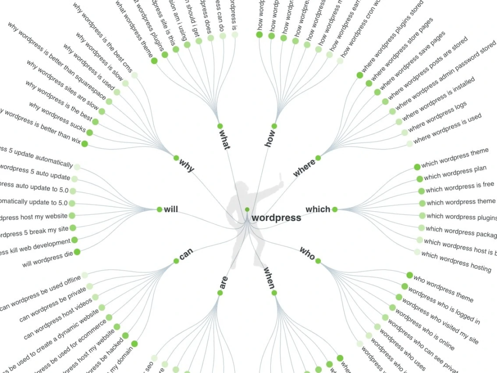
Answer the Public is also an excellent tool to get keywords framed like questions:
- Provide direct answers to these questions in your content to appear in the Google AI Overview and People Also Ask sections. Voice command systems like Siri and Alexa can also read the responses to your users.
You can also create comprehensive FAQ pages to answer commonly asked questions about your product or service.
- If you’re a multi-location, local, or franchise business owner, optimize for local SEO to appear for local search queries.
- Add alt texts in images to improve accessibility and help users with visual impairments and mobility challenges access your content.
Conclusion
Mobile SEO in 2025 is about delivering a frictionless experience that can convert visitors to leads and long-term customers. Google’s mobile-first indexing is the new norm, which means your site must be optimized to load faster, navigate easily, and engage visitors.
Every second counts when you’re attracting new users, and optimizing your website for mobile is the best way to win in SEO. However, if you’re unfamiliar with the nuances of mobile SEO and need help with the technical part of your SEO, fill out this form to tell us about your business. One of our experts will reach out to learn more about how we can help your business succeed in SEO and other areas of your marketing needs.
